Print ideas
Logo and Emblem Design
Logos are graphic designs that allow the audience to understand the type of service, goals, and product of a company. You've probably come across the saying that logo design is the easiest thing in the world. Today, one million people work in the logo design industry, but what makes some people professional in this field? What makes a logo unique? And what makes a logo quality and memorable?
Here are some tips to help you stand out from the crowd. And let's take a look at the features of the big business logos.

Tips that make a logo stand out:
Using Visual Double Entender Technique: The world's largest logo designers are interested in this technique. In this method, the logo is designed as two images that have a simple image and a clever image. I would like to explain this technique to you with an example. Note the image below.
The first thing you notice at first is a thumbnail of a "soldier" but you notice more accurately the person playing the golf. Designers who use this technique cleverly design a memorable image. Basically, viewers love small mental games.
Avoid stereotypes: However, once a year, new fashions appear in the logo design industry, and these fashions can be seen in the logo of any design. It's not good to use an idea over and over again. Like using typography in logo design. So be creative and put your ideas into action. This is something that makes you unique. Make plans for yourself. Remember that the first idea is usually the most productive idea. So before designing, try to have one or two pages of quick initial design.
Design foolishly: Don't look for complicated things. Don't be afraid to be simple. Attractive illustration and excellent typography are not always complicated. Simple but powerful logos have always permeated the business world. Time is always the best option to prove this. The best example of a simple logo is the Apple logo. Isn't the incomplete image of an apple memorable? The missing apple is a symbol of a missing byte and makes the logo unique and gives it a deep meaning. The whole apple is boring and with the removal a piece of the apple, the apple suddenly becomes a symbol.
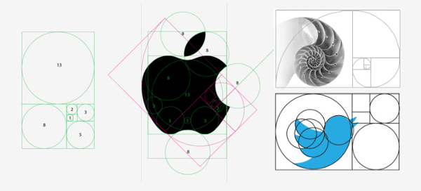
Consider the ratios and symmetries:
Symmetry is very important in the world of design. Pay attention to the image below. The designed circles indicate that the curves and arcs have no purpose other than to design a symmetrical and balanced logo.
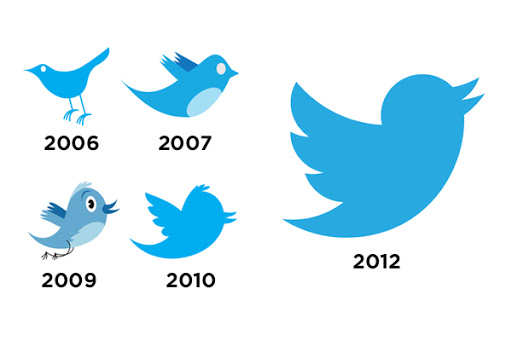
Gradual change of logo
A sudden and complete change in the logo creates a sense of alienation between customers with the modified logo. That's why changes need to be made gradually. For example, Twitter has started to change the logo from minor issues and has rarely decided to change and edit the logo. The logo created an active bird from a passive bird and designed a moving bird from a flying bird.
Find out what a logo means:
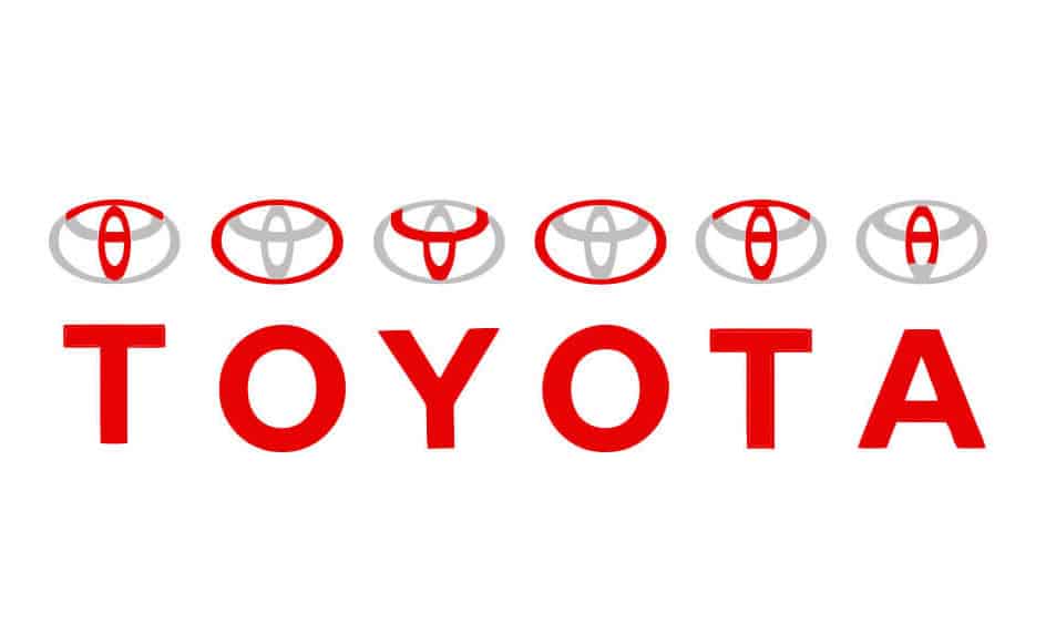
Every good logo tells a story, whether overt or covert. You can see a clear example of the story in the design of Toyota's car logo.
Toyota's logo clearly shows the letter "T". According to Toyota, the "T" consists of three distinct ovals, each with its own meaning. The two overlapping ovals in the center indicate the relationship and trust between the company and its customers, and the besieged oval reflects the global expansion of Toyota and the endless opportunities ahead. The logo also forms the steering wheel and represents the car itself. Even the empty space in the logo means representing the company's "infinite values."
It is very important and basic that after designing a logo, you can explain what is behind the design of a logo. With this argument, you disrupt the customer's mind and deliver something unique.
Similar Articles