Print ideas
Catalog Cover Design with Pantone Paints
Introduction :
The color scheme adds spirit to the design of the catalog cover. Remember that what you see in the catalog is not the Design of the cover, but the design printed on the cover of the catalog.

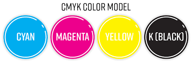
The colors used to design the Catalog cover are known as RGB colors. RGB colors are actually simulated colors of nature. And the colors used to print the catalog cover are known as CYMK colors. The CMYK color model is also called "four colors", a combination of the four colors of turquoise or cyan, purple or magenta, yellow, and BlackOrKey, abbreviated to CMYK.
The combination of these four colors makes up the rest of the colors, and the resulting color spectrum is not as large as RGB colors. This has become a concern for catalog cover designers because the mismatch between colors at different stages of design to printing is quite different. To solve this problem, Pinton paints came into play. Every day, more than 10 million designers and builders start designing catalog covers using Pinton or Pantone colors. About 5,000 color combinations have been introduced by Pantone. Pantone is also a leader in the printing industry, but the use of Pantone paint is very useful for print industry catalog cover designers. You are familiar with design software. Software such as Adobe Creative Cloud Illustrator or Photoshop. The software defines the color palette of Pinton and makes it easy for designers to use the color Pinton. In this case, the color of the design and print will be the same.

Pantone Color Applications for Catalog Cover Design
Considering the tips above, the uses of Pantone paint for the catalog cover can be classified as follows:
1- Creating a special organizational color for catalog cover design
2 - Prevent the occurrence of problems in various situations, including printing the cover of the catalog
3- Creating special color effects in designing and printing the catalog cover
How to Use Pinton Colors to Design a Catalog Cover?
Pantone paints are a range of built-in paints that are used separately from CMYK paints. There are Pantone, Gold, Silver, Phosphorus, etc. in the range of colors. Many Pantone colors cannot be obtained with four CMYK colors, and only in some cases can a color close to Pantone be created with CMYK. Now consider this. You know that green, depending on the amount of opacity or brightness, can be made with different combinations of two colors, black and yellow, with different percentages. You can also see the created color on the monitor (albeit with a slight difference compared to the printed color), which means that it is enough to display the color menu in the software used by you and enter the desired percentage. Similarly, other colors can be created with different CMYK combinations. You can look at the monitor before printing and find out the range. Now consider that in a print job we want to use Pantone colors in the design and printing of the catalog cover. Have you ever considered using Pantone paints in combination on a catalog cover? In this case, what is the color combination of the two Pantone colors in the catalog cover? Going back to the previous section, we said that by changing the CMYK percentages, you can see the built-in color. But how do you know how to design a Pantone color catalog cover before printing? The point that can be discovered and can have many applications in the design and printing of catalog covers:
One solution is to use Duotone, etc., to combine the four Quadtone colors in Photoshop.
To do this, go to the Photoshop software and create a new page, now black out the screen color using the Filltool tool, then go to the Image menu and select Duotone, and then select the Pantone color menu, for example, select C 117 Pantone color. Now select the Tritone type from the Duotone menu and then select the Pantone color. In this case, you will see a two-tone Penton combination on the monitor screen.

Similarly, you can choose the third color, for example 012C Pantone. In this way, you can simulate the combination of the three colors of the Pantone on the monitor screen to some extent, and before you publish your work, you will be informed about the combination of two, three or four colors of the Pantone. Here are some tips to help you get the most out of your Pinton color.
Similar Articles